This is a live, executable version of the analysis you’d do in the app’s embedded notebook. It loads a small sample recorder dataset shipped with these docs — the voltage magnitudes from the NLR DSSE IEEE 123 example — and reproduces the kind of plots you see on the results page.
When you run your own simulation, the app writes the same kind of Feather files to the
run’s build/ directory and points the notebook’s DATA_DIR at it.
from pathlib import Path

import numpy as np
import pandas as pd
import matplotlib.pyplot as plt

# Sample recorder output committed with the docs. In the app, this would be
# DATA_DIR = <run>/build and you would read the recorder Feather files there.
DATA_DIR = Path("../data/sample_results")
if not DATA_DIR.exists():
    DATA_DIR = Path("data/sample_results")

estimated = pd.read_feather(DATA_DIR / "voltage_mag.feather")
true = pd.read_feather(DATA_DIR / "true_voltage_mag.feather")
estimated.shape, true.shape
((5, 279), (6, 279))Each row is a timestep and each column is a bus (e.g. 150.1 is phase 1 of bus 150).
A time column carries the timestamp. Let’s split the timestamps from the bus columns.
def bus_columns(df):
    return [c for c in df.columns if c != "time"]

buses = [c for c in bus_columns(estimated) if c in set(bus_columns(true))]
print(f"{len(buses)} common buses, {len(estimated)} estimated timesteps")
estimated[buses].iloc[:, :5].head()
278 common buses, 5 estimated timesteps
Voltage profile across the feeder
Plot the voltage magnitude at every bus for a single timestep — the estimated values against the true values from the feeder.
t = min(len(estimated), len(true)) - 1  # last common timestep

fig, ax = plt.subplots(figsize=(9, 4))
ax.plot(range(len(buses)), true.loc[t, buses].to_numpy(float), label="true", lw=1)
ax.plot(range(len(buses)), estimated.loc[t, buses].to_numpy(float), label="estimated", lw=1)
ax.set(xlabel="bus index", ylabel="voltage magnitude (V)",
       title=f"Voltage profile at timestep {t}")
ax.legend()
fig.tight_layout()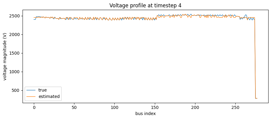
Estimated vs. true
A state estimator should land close to the true values. Plotting estimated against true should cluster along the diagonal; the mean absolute relative error (MARE) — the same metric the app reports — quantifies the gap.
x = true.loc[t, buses].to_numpy(float)
y = estimated.loc[t, buses].to_numpy(float)
mare = np.mean(np.abs(y - x) / np.abs(x))

fig, ax = plt.subplots(figsize=(5, 5))
ax.scatter(x, y, s=8, alpha=0.6)
lims = [min(x.min(), y.min()), max(x.max(), y.max())]
ax.plot(lims, lims, "k--", lw=1)
ax.set(xlabel="true |V|", ylabel="estimated |V|",
       title=f"DSSE estimate vs. true  (MARE = {mare:.2e})")
fig.tight_layout()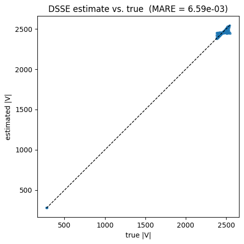
Try it on your own runs
Run any template from the Saved Templates page, open its
Notebook, and set DATA_DIR to the run’s build/ directory. The recorder Feather
files there have exactly the columns used above, so this analysis carries over unchanged.